Our Small Galley Kitchen Update

Us for scale. Photo by Modern Nest Photography
This was less of a renovation and more of a re-facing of our galley kitchen in our Beach House. I’m not sure the sweat and tears that went into this project translate in the photos as now it looks like it was an easy and breezy transition. When we moved in to our new place in April I knew I wanted to make the kitchen more us but I had a small budget and wanted to salvage as much of the current kitchen as possible. Renovations to me are a balance of considering the budget versus the dream design while also trying to avoid the wasteful aspects of construction.
The previous kitchen was glossy and while glossy is good for some people and actually wears better than matte - it doesn’t work for me. Honestly the way light reflects off glossy surfaces is hard on my eyes (I think it has something to do with having light eyes). Please don’t write me to let me know that you prefer the previous kitchen, that is wonderful, in your house you can keep the glossy cabinets and mosaic tile but for me, as someone who spends more time in the kitchen than she would like, I really wanted a kitchen that felt like a calm and peaceful nook in our home.
Keep the layout and appliances - I liked the layout of the existing kitchen. Since our previous apartment was open floor plan, I was excited for a smaller tucked away kitchen. And while I love the concept of open shelving I knew that it’s not something we could maintain as a family. Also this kitchen is quite small and doesn’t have a lot of space for food so I wanted to keep as many cabinets as possible for food storage ( I miss my old pantry!!).
We were lucky that the appliances had been recently updated and while small - a 24” convection steam oven and 24” fridge and a standard dishwasher - they have been working well for us. I thought such a small oven would be challenging but it cooks so fast that I don’t mind having to make a couple rounds.
Keep the countertops - I didn’t love the countertops but they aren’t awful. They are a pale grey quartz that has some sparkle in it. Really not my thing, but countertops are expensive but more importantly it feels really wasteful to rip out fully functional and good quality countertops just because they aren’t the exact tone and colour I wanted. I felt the responsible thing to do to was to keep the existing countertops.
Choosing to keep the countertops as the more sustainable choice ended up guiding many of the other design choices in this space. I needed to work with the grey and not against it.
Replace the door and drawer fronts - I replaced the door and drawer fronts with IKEA matte white Veddinge ones. I asked my favourite local millwork company if I could have custom wood handle cutouts and we came up with these maple ones together. They are made from maple wood off-cuts from larger projects that would otherwise be waste. They feel really nice in person! I wish you could feel them! I initially wanted cutouts with a wood backing but we realized quickly that while it would look pretty, it wouldn’t be very functional because you can’t get your fingers through to the other side to grab onto something. These maple cutouts have been working out great. I also toyed with birch or maple plywood doors to replace the existing ones but decided against it because of the grey countertops. If I had switched out the countertops to white or cream then I think I would have gone for the plywood doors (next kitchen!).
Switching out the doors and drawers took Trevor and I one long night after the kids went to bed and then all the filler pieces and caulking took another week and a few extra trips to Ikea. It’s tricky retro-fitting an existing kitchen. Many of the filler pieces were glued in place and it wasn’t easy to get them out!

The right hand side of the kitchen. Stove, cooktop and hoodfan.
Replace the tile backspash - We attempted to remove the glass mosaic tile ourselves and it proved too difficult for our DIY skills so we hired a local handyman company to remove it. It was worth the extra cost as they were skilled and did very minimal damage to the surrounding walls and cabinets. The wall was so banged up after that we need to re-board the walls which Trevor and I did ourselves. It took us quite awhile ( a few weeks after the kids went to bed or a weekend and help from screens) but we saved by doing it ourselves and learned some lessons along the way.
New Tile - For the tile I chose the Fireclay Field Tile 3”x 3” in Calcite. It was a perfect match for the cabinets and I love the retro-inspired shape. Most square tiles are 4”x 4” or 5” x 5” so there was something special about the 3” x 3” to me. For the grout I went with Mapei Frost as a match for the countertops. I hope it’s showing up in the photos but the tile is so so beautiful in person. It’s thick, you can feel the handmade nature of it. It Feels really good to have something handmade in our kitchen especially since I went affordable on the doors. I’ve long admired Fireclay Tile and their values (carbon neutral! certified B corp! Recycled Tile body!) so this feels like the perfect element to complete our kitchen update.
Oh and our DIY skills still fall short at tile install. I didn’t want to take a chance on this beautiful tile install and hired the best (who also installed our beautiful fireplace surround). (full disclosure: tiles were gifted, I was responsible for some costs and the installation costs. It is a great pleasure to partner with a company whose values align with my own).

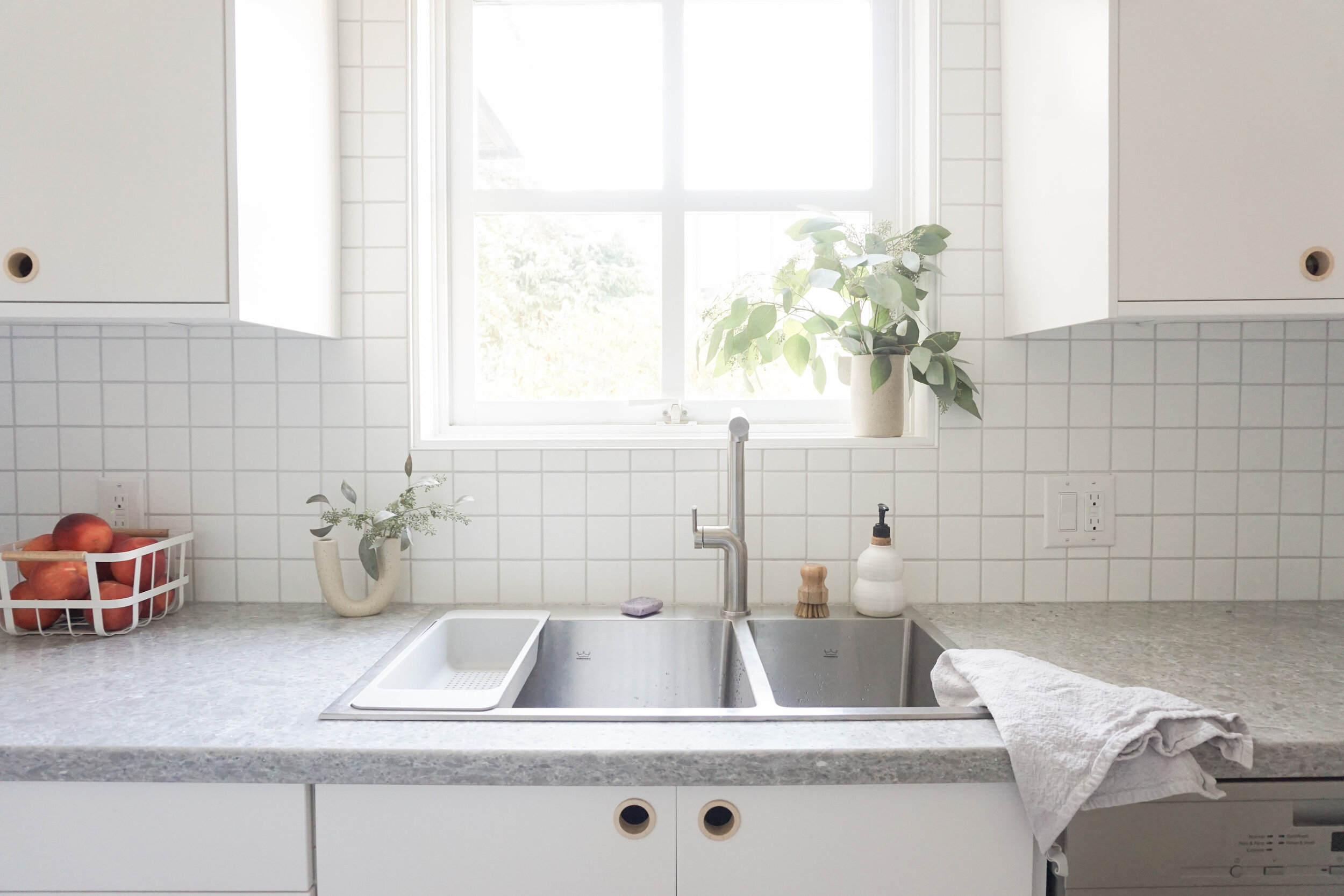
Left side of the kitchen. Sink, faucet and dishwasher.
Paint - I painted to match the rest of the apartment in Benjamin Moore Chantilly Lace in Eggshell and with Pearl finish for the window.
Replace the leaky faucet - The existing faucet was plastic and broken and leaked down the back so I replaced it with a new one. I searched high and low to find one that had a pull-out (because I find it critical for keeping a clean sink) but also didn’t reach up into the window. The window! I can’t believe an apartment kitchen has a window!I chose a stainless faucet to match the stainless sink, again working with the existing items to avoid unnecessary waste.
New Flooring - The previous floor was linoleum laid over black tile. I wanted the wood floor to carry into the kitchen to make the whole space feel connected. I also think the oak floor helps to warm up the white kitchen and highlight the maple handles. More info about our floors in this post.

Corner of the kitchen.
Details - I added this beautiful handmade shelf to add some wood and warmth to the space. There was JUST enough room for it and I have to be careful opening the right cupboard door so I don’t bump it. On it are my favourite Menu Salt and Pepper grinders, favourite cups and vase from Lisa Warren Ceramics.
Light - I switched out the cold bright flushmount light for a soft white round globe light (commission link) and put it on a dimmer. You can’t see in these photos but I love how this light relates to the small globe light around the corner.
For fun here are some before photos of the kitchen!
BEFORE

BEFORE

AFTER

So that’s the kitchen! Hopefully some of the info was helpful. I feel like there is more to say so let me know if you have any questions in the comments below. Thanks again to Fireclay for being an important part of this renovation.